Hot Font or Not?

Choosing fonts is a fun, creative part of design. Here’s some advice especially tailored for good text uses. We’re including how to ensure fonts are easy to read, match the mood of your project, and how to avoid clichés. Is your font a hot font or not? To make sure your next project uses the hottest fonts, read on.
Readability

The most common mistake when choosing a typeface is also the most obvious: the font must be easy to read. Here’s an example of a few different fonts:As you can see, these fonts range from easy to difficult to read. To appear stylish, but legible, we should pick something in the middle.
Balancing Style
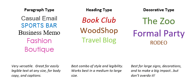
Simple fonts are best for blocks of small text such as paragraphs. Large fonts are good for headings. Some fonts are decorative and exist best as artwork. Choosing fonts for the correct application will add style without losing function.

Matching Your Message
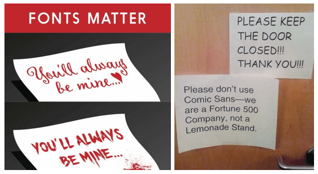
We’ve all seen examples like the ones below. Writing a professional letter? Use a simple or traditional font. For a kid’s birthday party invitation, feel free to use a fun font, just don’t forget to include the date. Remember, fonts matter for your message.

The Good, Bad, & Ugly
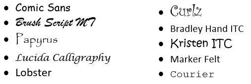
Here’s a list of problematic fonts we recommend you avoid using moving forward:

Google Fonts: Over 800 fonts free for commercial use on the web or for print. High quality.
Font Squirrel: Thousands of legitimate fonts. Helpful font identifier tool.
Dafont.com: 30,000+ free fonts. Licenses may be required for commercial use.
